Company
Renault digital design
Production
Design thinking, User research, Userflow, User interfaces, Prototyping.
Date
March-August 2020
Role
As a UI/UX designer, I played an important role in working on current and advanced projects involving future Renault vehicle screens and human-computer interactions.
The design internship
Working on advanced design projects is understanding the innovation of technology in the upcoming years. This includes the combination of auser-centric approachto modern technology and the process of showing simple information so all users can comprehend the interfaces.
Study cases
Projects and research developed during my UI/UX internship.
Decluttering
what is decluttering and why is it essential for the perception of human-computer interactions?
Decluttering is a process to strip off non-essential information to make the interface cleaner and easier to understand. This method is as important in activities that require high levels of concentration, as it is to those activities that we multi-task.
Advanced Design
For a user-centric study, it is essential to understand the progress of technology on board every vehicle.
Cities are growing at exponential rates. A greater percentage of vehicles will be electric-driven. By the year 2030 vehicles will become less personal as cities develop public and automatic transportations and into a new civilization.
Light Exposure
The study of the effect of Blue light on the driving behavior of the user.
The blue light exposure at night in a driving simulator increase drivers’ alertness and attention when responding to visual distractions. Although blue light can increase the users' awareness, it can also affect the users' mental health and cause aggressive driving.
User Needs
Elements that define a user interface
Screen features
Evaluate
Visualize and classify the importance of each individual information to understand what needs to be brought forward.
Number of interactions
Hide
Declutter data by only having it accessible when it is required, improving the user interface by simplifying the interaction process.
Time of evaluation
Wireframe
Rearranging the main skeleton of the product, find the best method to access information in a faster and more effective way.
User satisfaction
Create
Find a suitable design that will bring something original and modern to the product without overloading the appearance of information.
Solution: Translate information by morphing the environment instead of adding complex data.
Why
Users don't have time or ability to concentrate on complex information while they're driving. The information they receive needs to be more instinctive and natural to understand and experience.
What
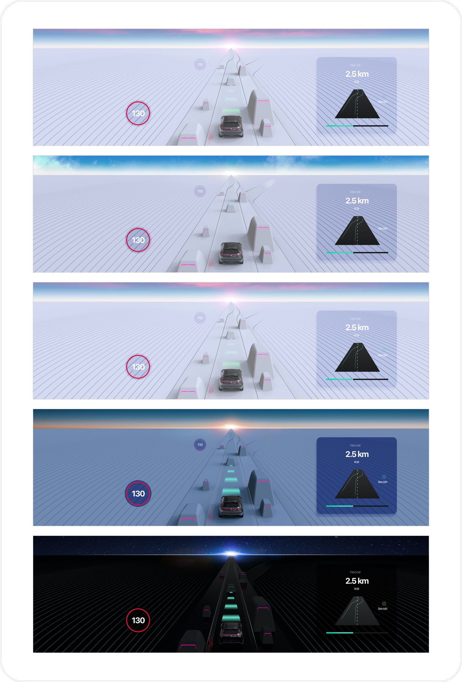
Using environmental transmutation and color code features, users will take place in a non-distracting visual experience, allowing them to concentrate on the road.
How
The human brain takes less time to process colors and simple shapes than it does with written and complex data. Hide and classify information.
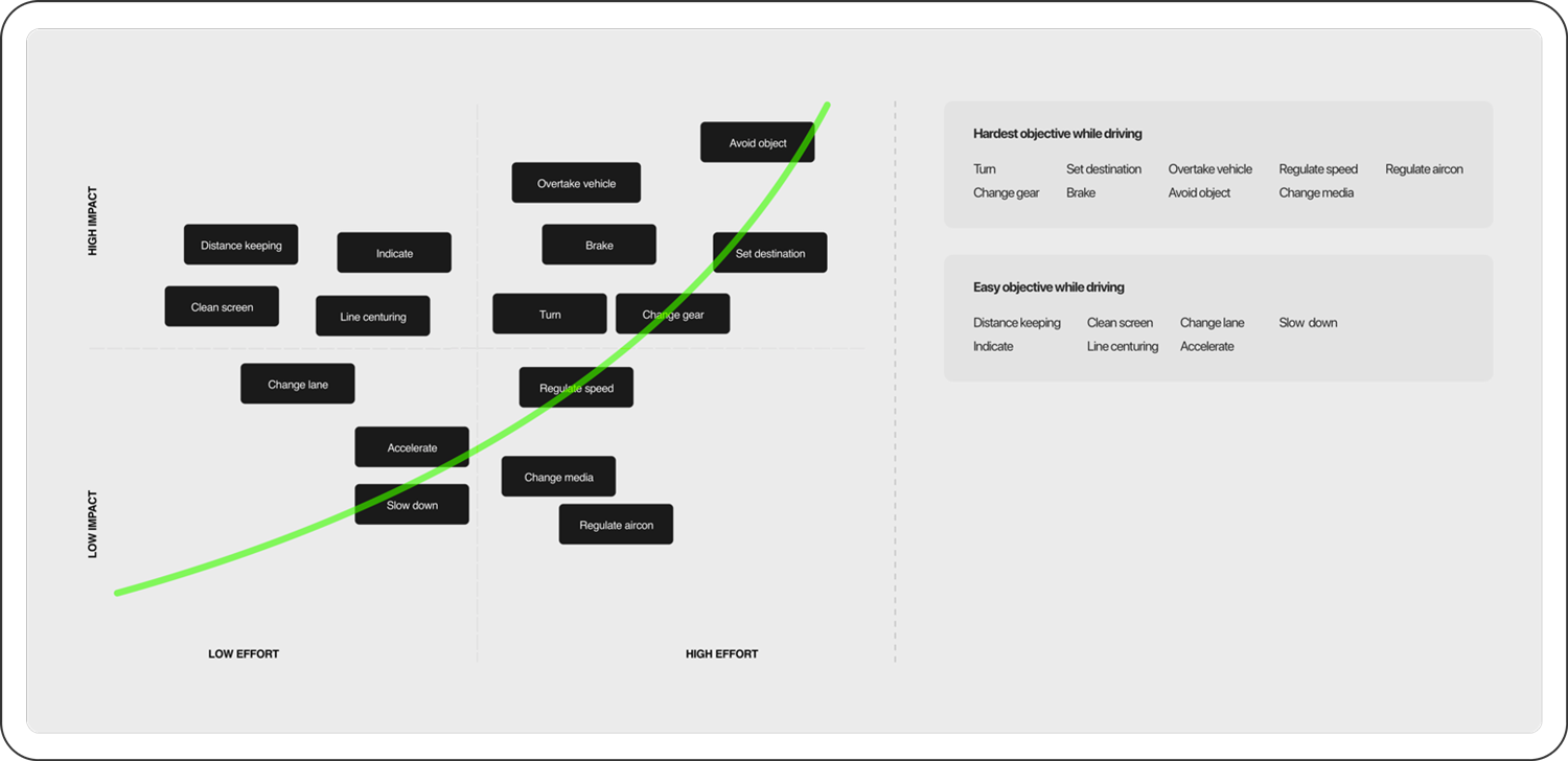
The impact of driving features.
Judge the importance of simple screen features to classify and modify their representation and influence.
Vehicles are becoming more and more connected as we approach a digital and automated future. The innovation will have a large impact on the automotive industry. Sensors and captors will allow the driver to experience a whole new environment. It is important to limit the number of information present on the interface.
Information features
The main innovation assets to add to the current screen product.
Color information
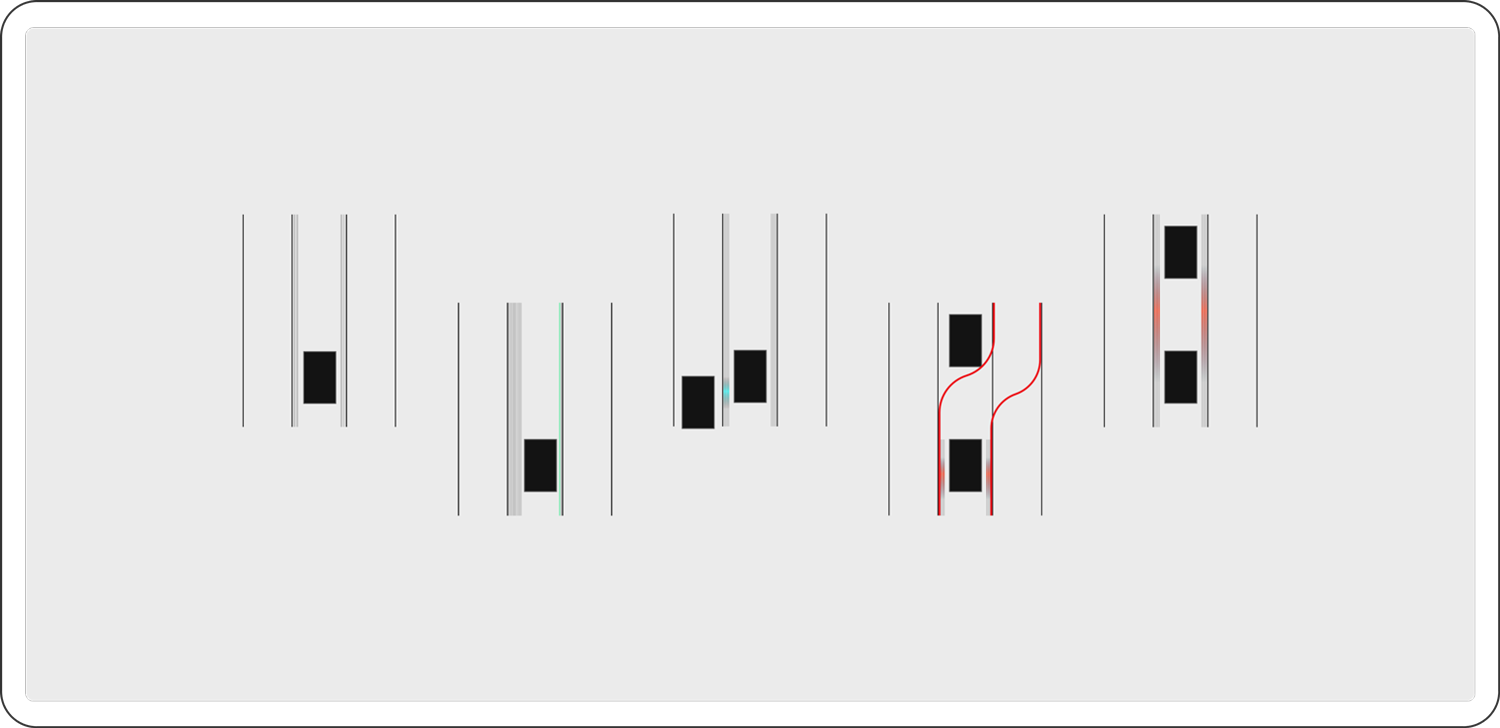
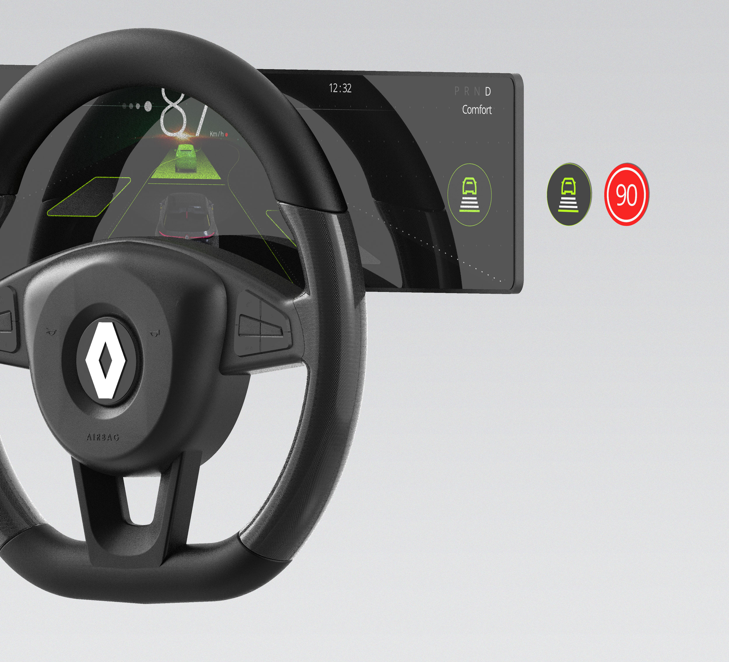
when it comes to the automotive industry, users are familiar with color codes. All of which can warn and prevent accidents. Here using colors to show overtaking vehicles, navigation, but also the objects present on the road can impact the user's eyesight while driving.
Constructive scenery
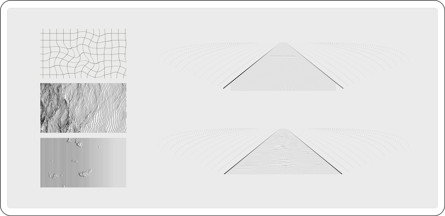
Being on our way towards a connected future, vehicles will be equipped with highly accurate GPS and laser technology capable of modeling the environment. For example, this will translate information seen today on the Waze app to warn of stationary vehicles, potholes, lane.
Camera evolution
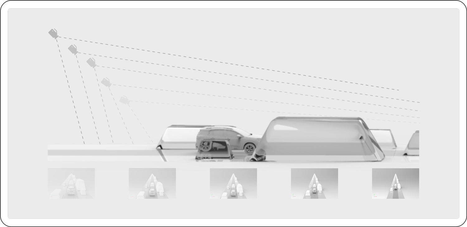
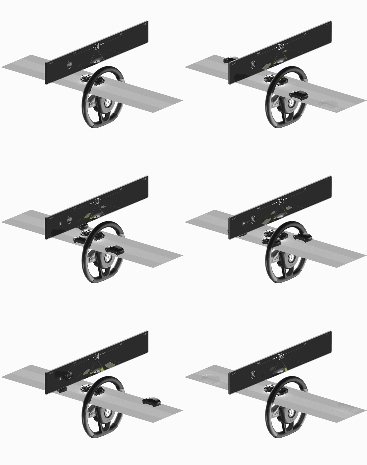
A drivers focal length is reduced when driving at high speed. This means that the faster you drive, the more your vision is impaired. . Camera evolution is designed to help augment visualization when speed increases. The faster you go, the more the camera will gain height.
User interaction flow
The interaction flow allows the understanding of the usage of the product.
In this case, I analyze how the AI will respond to common dangers and actions needed when driving.
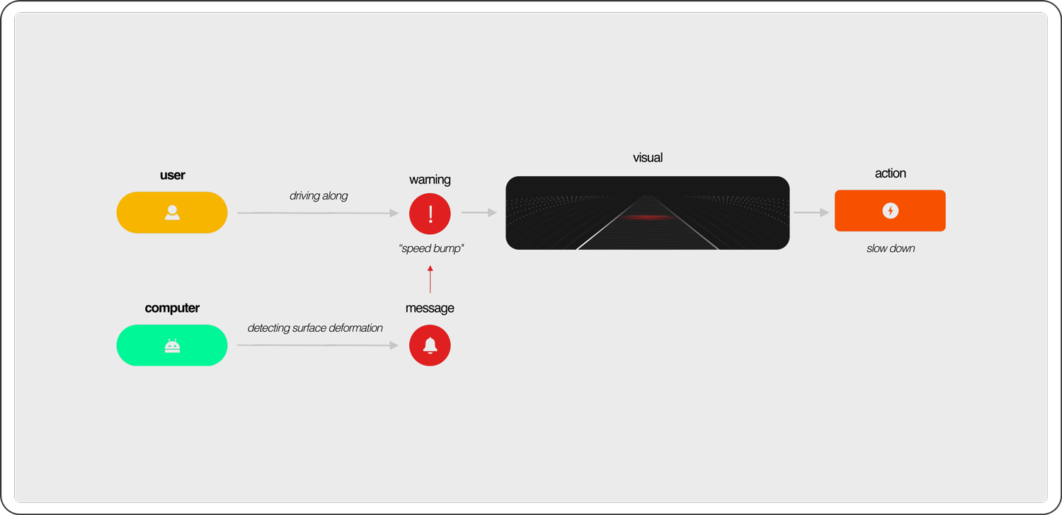
This user flow shows the fast Human-computer-interaction required for upcoming surface deformations. The computer will constantly anticipate the surrounding danger to warn the user at the perfect time depending on the driver's speed.
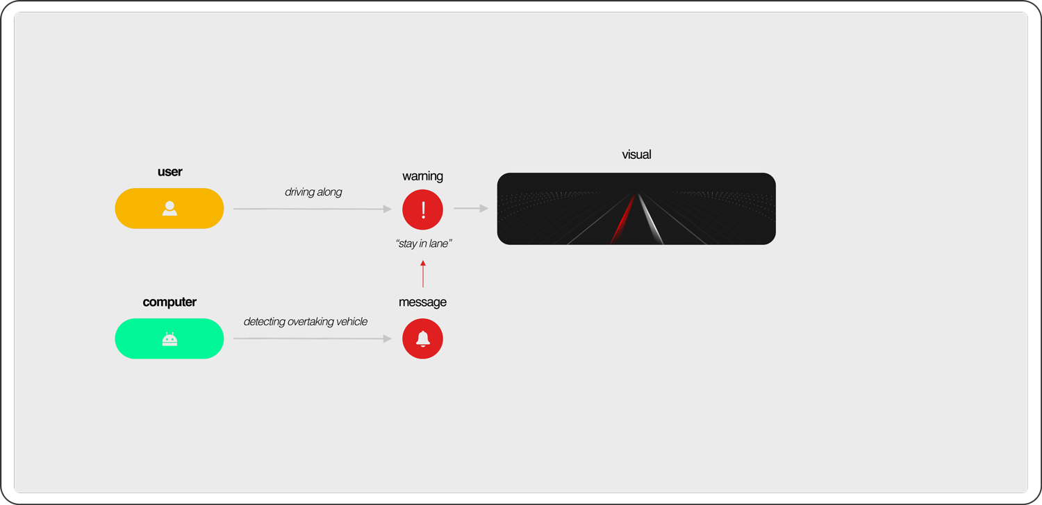
In other cases, when the user detects danger it will send a warning sign to the driver without requiring any actions. This is prevention.
Survey
To work with more general data from a large number of people I directed an online survey using Google forms.
49 responsesImprove mental health facing screens
commun answers
Keep mobile away
Peaceful atmosphere
Use headphones
Avoid social media
Music
Breathing with closed eyes
No notifications
How to bring relaxation to your vehicle
commun answers
Warm ambiance
Comfort
Music
Home-like atmosphere
Confidence
Aggressive drivers

>2h in a car per day

>4h on screens per day

Sleeping problems

Target Users
Understranding the user's needs and daily lifestyle, I elaborated two personas.
Both representing the two main target isuues of the new product. The personas where elabored based on real data gathered during the user survey.


Longitudinal speed
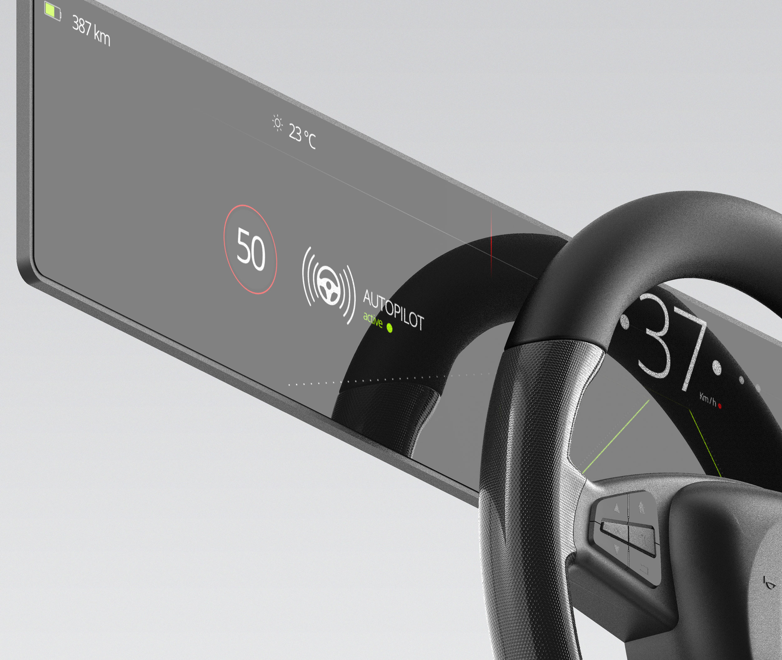
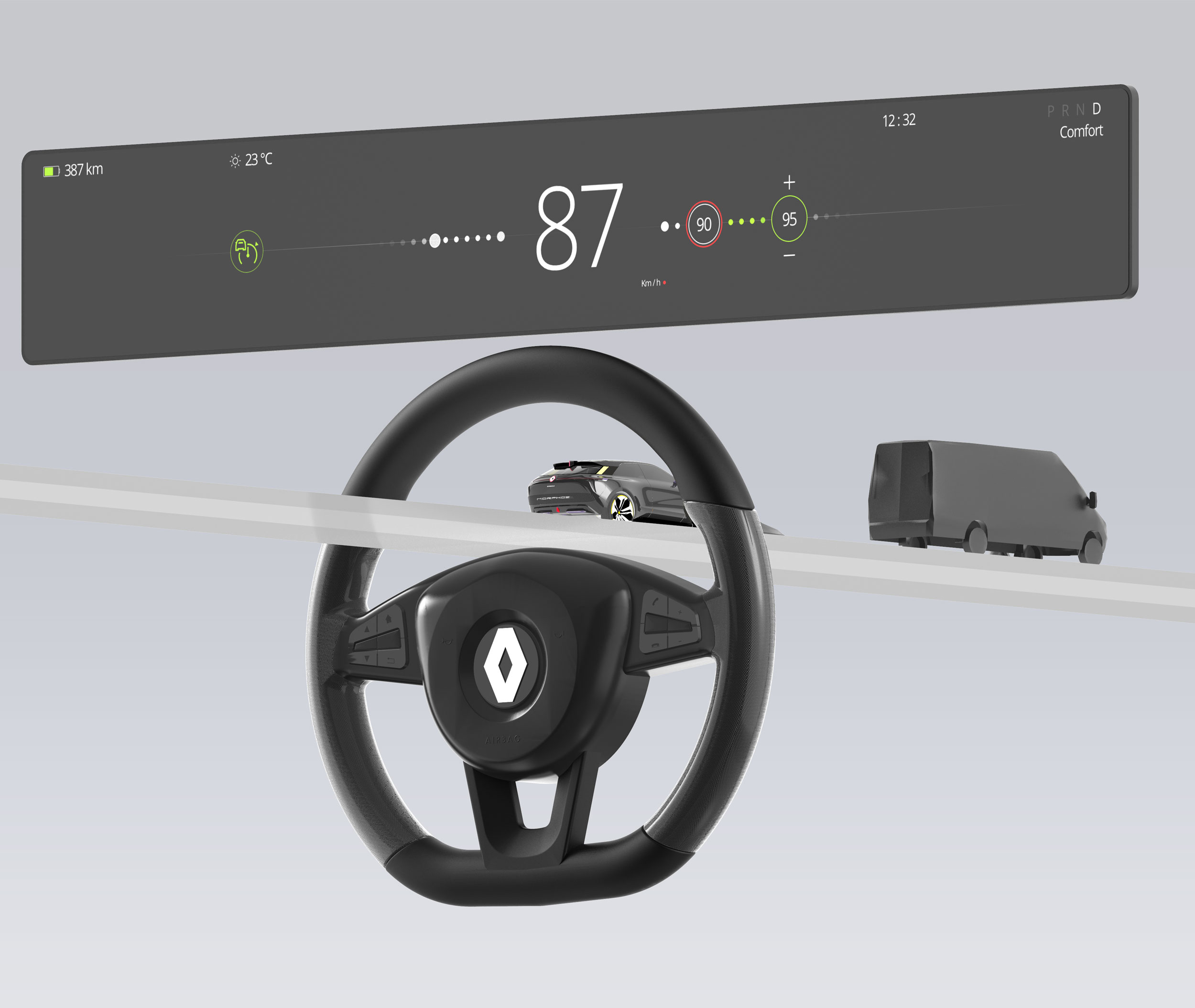
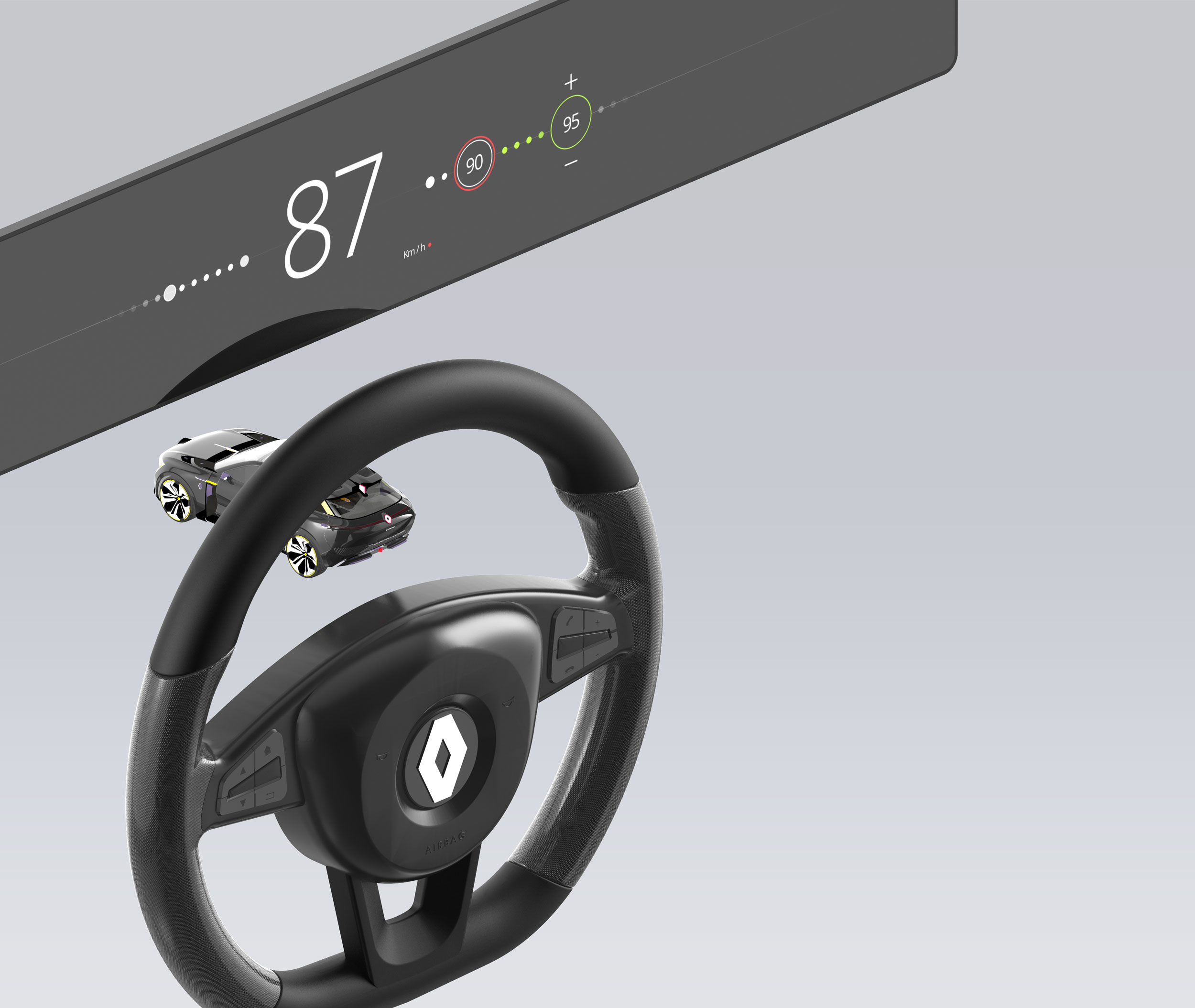
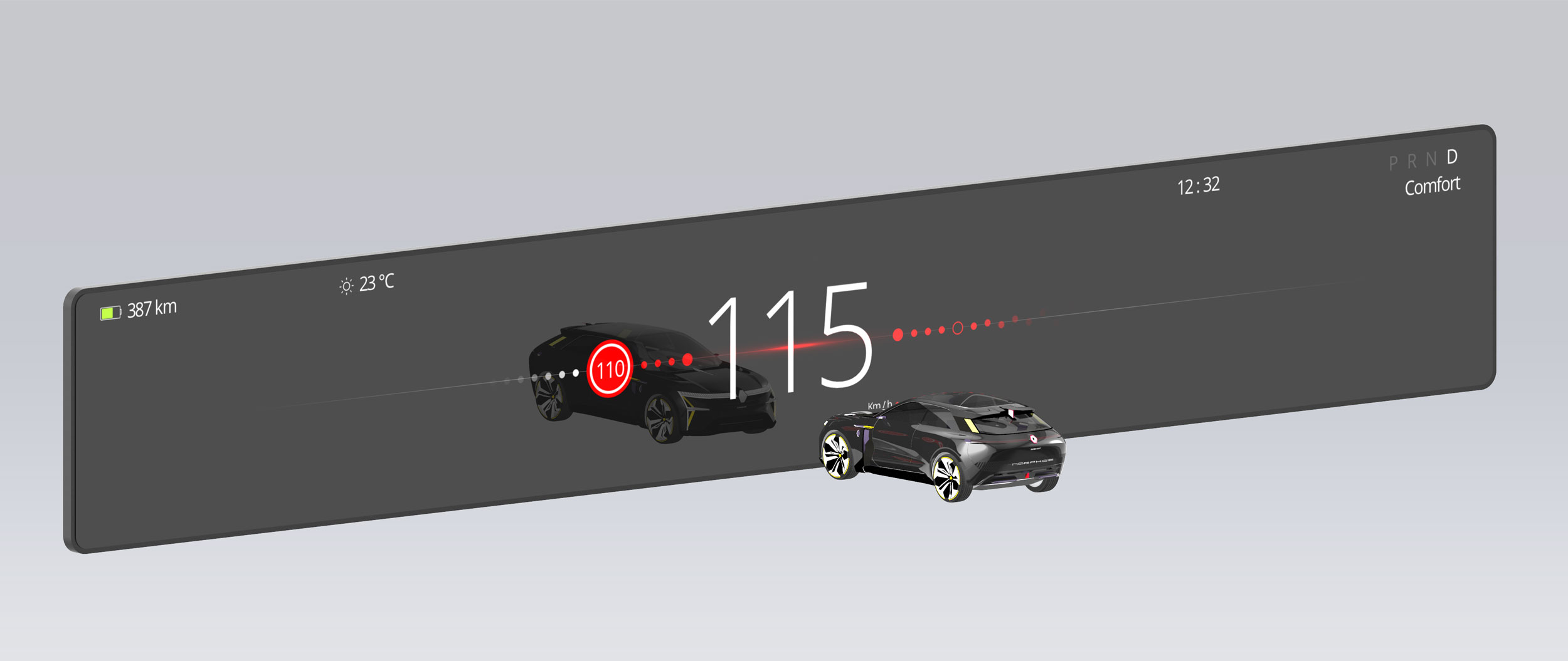
Towards a new compact and decluttered representation of speed.
The benefits of this new representation are to be able to visualize speed like a timeline that will transform and adjust itself to the users driving functions, but also present important information without occupying a large area of the screen.
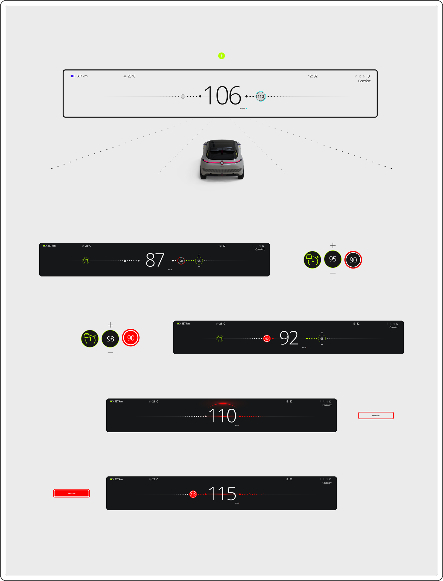
Production: creativity based on the research established.
immersive and connected driving experience. Screens are built to adapt the driving situation to the user. The system will analyze the information required in real-time without flooding the interface with unnecessary information.
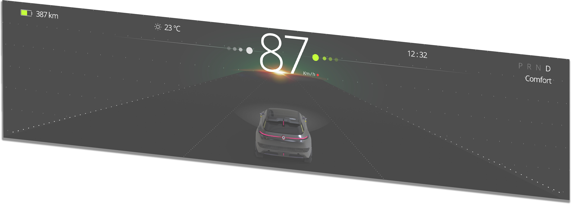
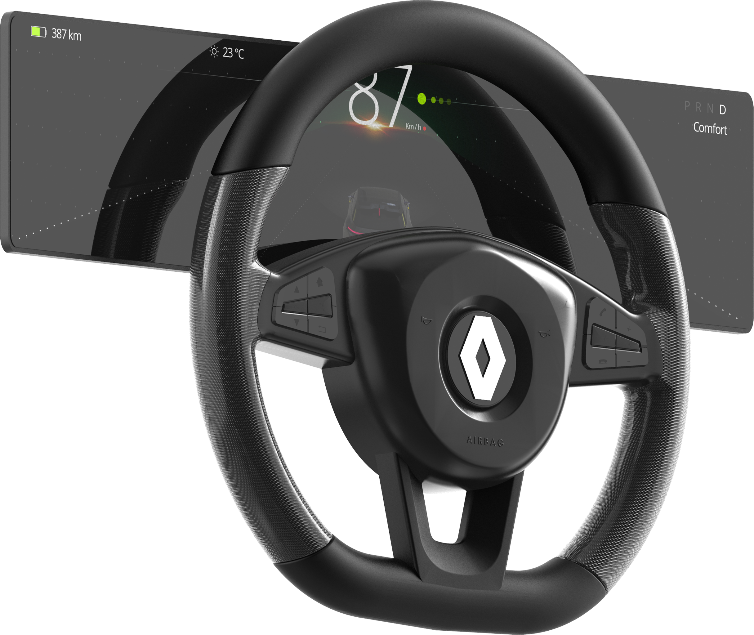
Adaptive environment
information will appear and disappear from the interface simultaneously.
Modern display
Build to adapt and learn how the user drives.
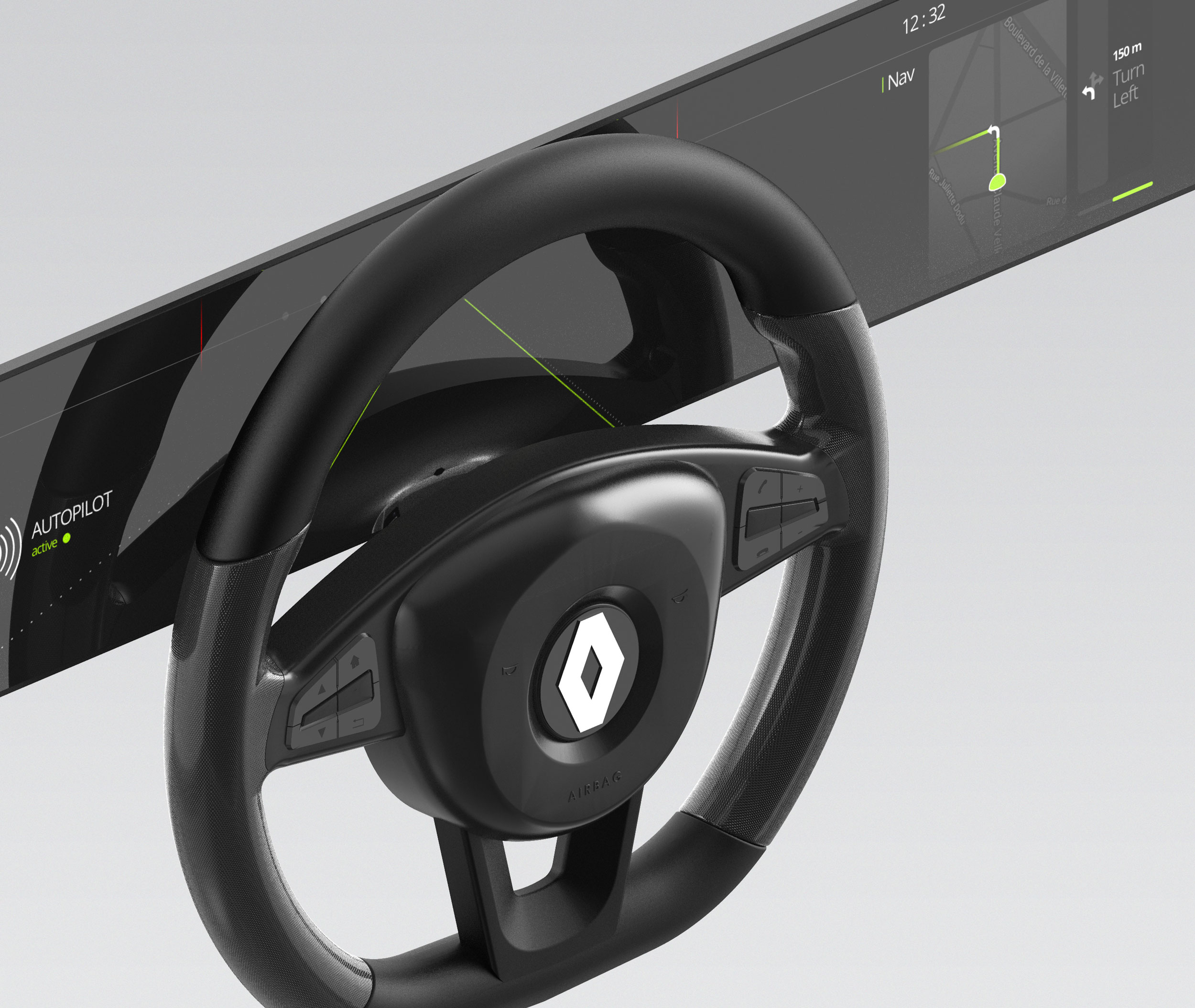
Representing Speed
For many years speed displays had been represented from bottom to top. Most representations are circular, complex, and take up a large part of the display. Representing the speed horizontally brings many opportunities to new layouts.
Screen effect
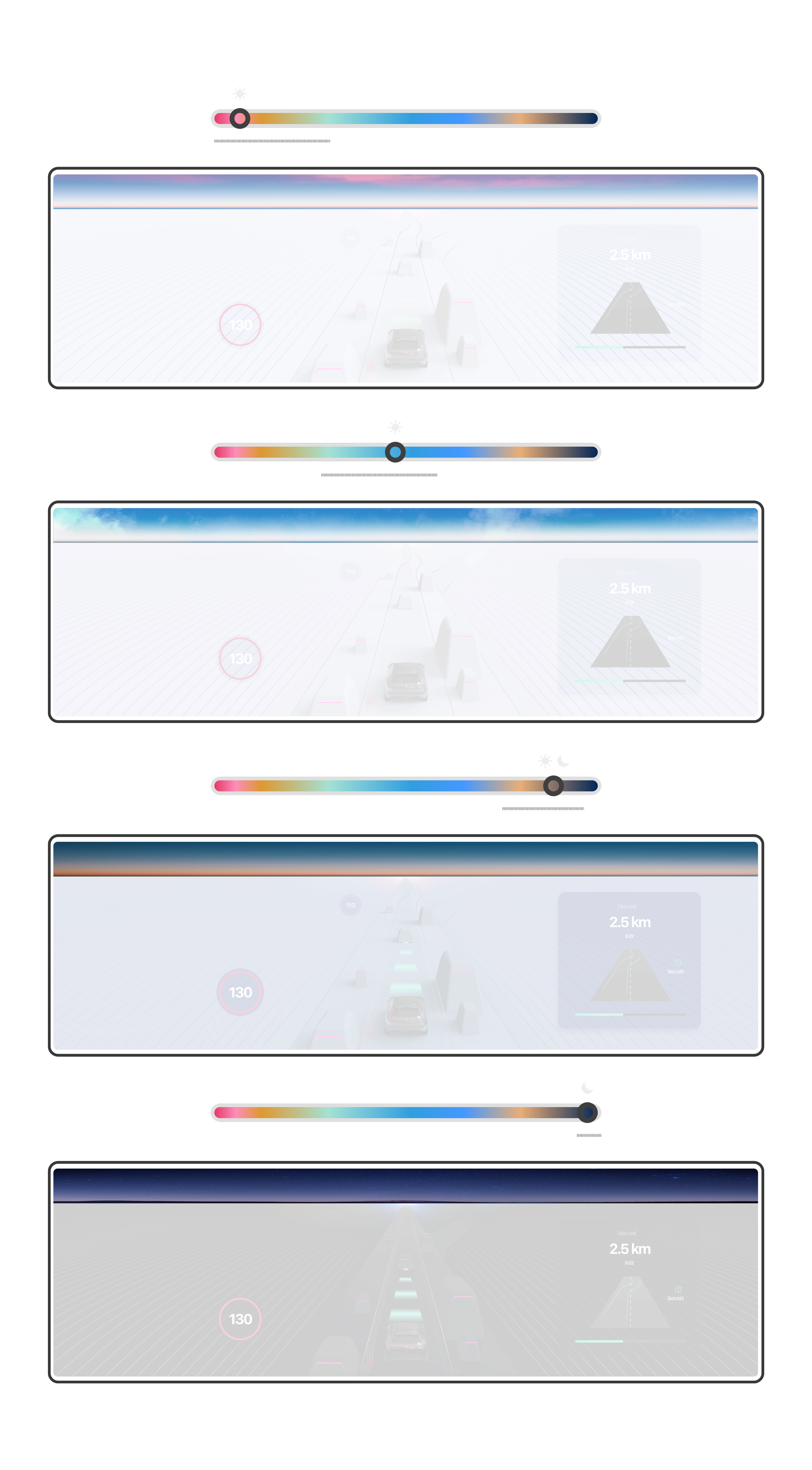
Screen time has a major effect on mental health and the user's mood. Most of this effect is due to screen reflections. Using adaptive lighting will stimulate the user's brain to differentiate night and day.
Prototype video

